

Responsive Web Design: What It Is & Why You Need It
By: Jennifer Carey
Have you ever pulled up a website on your phone or tablet and it looked different (not in a good way) than you’re used to seeing it on a desktop? You’re easily frustrated by all the pinching, zooming and panning you have to do so you can read it…right? If so, chances are, the site doesn’t have a responsive Web design.
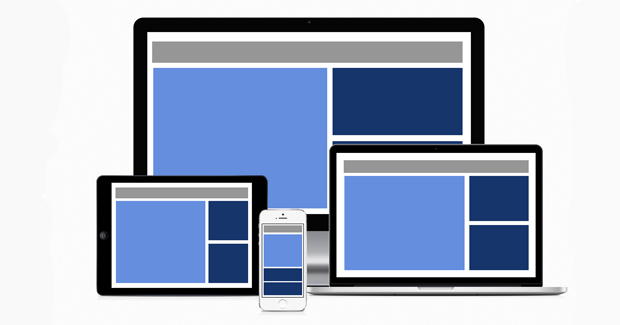
A responsive website is when the layout and content responds or adapts based on the size of the screen it’s viewed on. It is the same site and same URL – the only difference is it’s coded in a way that it will automatically resize its elements for whatever size device it is being viewed on, whether it’s a phone, tablet or desktop. In short, it’s completely flexible, regardless of device.
Important reasons why a responsive Web design is beneficial:
- Visitors expect a website to look good regardless of the device they are viewing it on. If you have a mobile-friendly site, you will increase the amount of time people spend on your site. They are less likely to stay on the site or come back to that site at a later time if your site isn’t responsive.
- Google recommends websites convert to mobile responsive design. Some websites have lost search engine ranking because search bots detected configuration errors related to displaying on smart devices.
- Consumers will make more than 50% of their searches on a mobile device by 2015. You want and need your website to rank just as high on a mobile device search as it does on laptops or desktops. By converting to a responsive Web design, you will position your site to rank as high as possible for any kind of search a consumer makes.
Is your site responsive? How can you tell?
If you’re not sure, a quick and easy way to determine if your site is responsive is to view it on a desktop or laptop. With your curser, grab the lower right corner and drag the window to the left, decreasing the width of the window. Do the elements (content, graphics, images) on the page collapse into a small-scale version of itself? If so, your site is responsive. If the elements do not move and the result of dragging the window is a cropped version of your site, then I’m sorry to say, your site is not responsive.
Walking the walk
Recognizing the importance of having a responsive Web design, we at Identity are in the process of updating our current website so it will be more responsive. We believe in the importance of a responsive site and always strive to practice what we preach. Every site we build for clients is designed to be responsive. We include this feature in all Web development and design projects because we recognize it is critical in today’s market.
With the increasing use of mobile devices today, it is necessary to have a responsive Web design. If you are starting a new business or thinking about redesigning an outdated website, your mobile strategy should be treated with equal importance as your traditional website.
What’s your take on responsive Web design? Have you incorporated this new design element into your site?