Lately, as I drive to work each morning, I’ve been noticing a lot of signage – a lot of poor signage. Those small yard signs that you see at the intersections usually advertising a fair, church function or some sort of liquidation sale are so crammed full of information that you can’t even read it when you're at the stop light 10 feet away. So, it got me thinking that perhaps some tips on effective sign and display design would be a good topic for my next blog post…
Signage is a very affordable means of advertising. There is a lot more to designing both indoor and outdoor signage than sometimes meets the eye. Most people don’t realize that there are many questions and factors that should be taken into consideration before and during the design process.
The following design principles are used by graphic professionals to create attractive, high impact signage that is readable, appealing to the eye and carries the most impact:
Keep it visible and legible - Less really is more. By keeping your message short, your sign is easier to see and read at a glance. Signs come in every shape and size, so make sure you have chosen a size that is appropriate for the distance you expect your sign or display to be viewed from. Consider where it will be located and what obstacles may be in the way. Visibility is the most important part of your signage.
Avoid clutter - Successful signage communicates a message concisely. The message should be conveyed in as few words as possible to your target audience. Crowding your sign with too many words or lines of text makes it harder to read from a distance.
"White-space" is the area of a design that is left uncovered by either text or graphics (white space can be color). The empty space surrounding text and graphics is just as important as other design considerations. There is a tendency to want to "fill up" the available area with as much copy as possible. But when text is crowded, it becomes harder to read. Thirty-to-forty percent of the sign's face area should be left as white space for optimal readability.
Type and fonts - In general, clean, crisp, easy-to-read type styles should be used for maximum legibility. Most professional fonts have varying weights, ranging from regular to bold, black, extended, etc. Use these to your advantage by giving priority or preference to certain parts of your message.
There is a misconception that exists that since ALL CAPITAL LETTERS are "larger" than lower case letters, they must be easier to read from a distance. However, visual tests have concluded that Upper And Lower Case Text is more legible from a distance than all upper case letters. Since viewers may only have a few seconds to get your message, increase the readability of your sign by not over using capital letters.
As a general rule of thumb, never use more than two different fonts in a single design. Choosing two fonts that complement each other can make your message stand out. Most importantly, use fonts that are clearly legible when viewed from a distance.
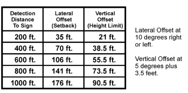
The following chart is from the United States Sign Council (USSC) and will help you to determine what size type is needed for your sign:

Images and graphics - Adding a border can increase reading speed by up to 25 percent. Borders are often recommended whenever automobile traffic is the intended audience. They tend to cause the eye to focus on the message. In addition, full-color digital photos can be incorporated into designs to add greater impact. Logos, artwork and other graphical elements can also be added to visually enhance the design and layout.
Foreground/background colors - When choosing a background for your design, don't use anything that will make it difficult to focus on the main message. Black contrasts well with any light color, and white works well with colors having a dark value.
The greater the contrast, the more legible text is from a distance. Colors that are closer together like a Kelly green letter against a royal blue background won't contrast as well and therefore will be more difficult to read.
Visibility of different color combinations - These 15 color combinations for lettering were tested for readability at a distance by the Outdoor Advertising Association of America (OAAA). The results ranked in the sequence shown, with #1 the most legible and #15 as the least legible.
1. black on yellow
2. black on white
3. yellow on black
4. white on blue
5. green on white
6. blue on yellow
7. white on green
8. white on brown
9. brown on yellow
10. brown on white
11. yellow on brown
12. red on white
13. yellow on red
14. red on yellow
15. white on red
Following the guidelines above will ensure that your sign is readable and your message gets across clearly to its intended audience. As always, Identity is here to help with any questions or projects you may have!
Do you have any additional tips on how to create effective signage?


