We are always looking for ways to make our clients more visible and help them shine. More than traditional public relations and social media, sometimes we’re tapped to guide companies through a full brand facelift.
That’s what happened with LightRx, who came to Identity in search of a refreshed visual identity. Our glowing creative work bringing new life to the medspa brand earned our agency a Gold Award in the integrated marketing category from the Hermes Creative Awards—an international competition for the industry’s best creative professionals.
It’s an honor to have our great work recognized as part of this competition—administered and judged by the Association of Marketing and Communication Professionals—which evaluates thousands of submissions from various advertising agencies, PR firms, communications departments, design shops, production companies and freelancers each year and select a limited number of winners. In addition to the LightRx brand refresh, Identity received recognition in multiple categories for 2021.
Here’s a behind-the-scenes look at how our team infused new life into the LightRx brand.
The Challenge
LightRx, a face and body medical spa (medspa), knew it was time to rethink its current brand look and feel. A bland, neutral color palette consisting of black, white and beige suggested a sterile and unremarkable experience. Unrealistic, one-size-fits-all imagery contradicted the idea of body positivity and personalization. It was time for LightRx to discover the brighter, healthier version of itself with a brand refresh.
The Approach
In the initial stages of the rebranding process, Identity facilitated a discovery session with the LightRx team to better understand their goals and objectives, and identify how they were set apart from their competitors. After the session, one thing was clear—LightRx didn’t actually stand out. In order to reach its full potential, the brand needed to reinvent itself to evoke feelings of confidence and liveliness in creating a comfortable and empowering customer experience.
The Execution
Our team quickly jumped into action creating a bright and lively visual identity that enhanced the look and feel of the LightRx brand. Components included:
Logo
An updated brand logo features a clean and simple design that emphasizes the value of LightRx. The butterfly symbolizes the journey it takes to become the best version of yourself, reinforcing the brand’s messaging and idea that confidence starts at LightRx.

Color Palette
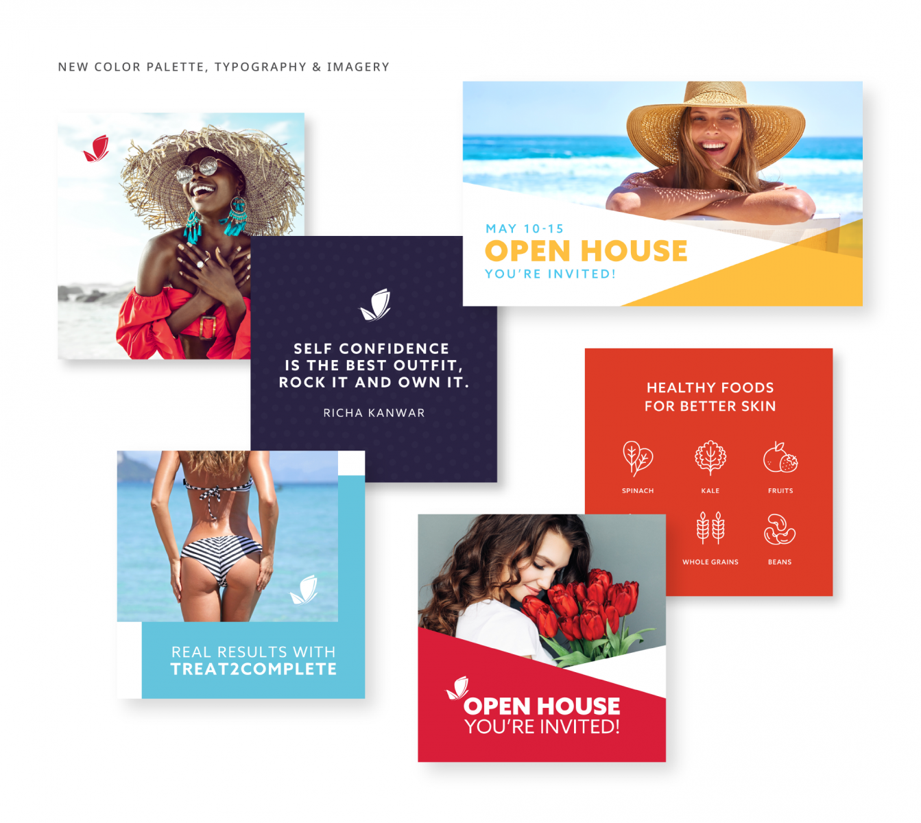
Moving away from the neutral color palette, Identity’s creative team implemented various bright colors to complement the brand’s striking red color. These bold colors, combined with simple patterns, not only provide interest to the eye but also enhance the brand’s visual language.


Typography
The Azo Sans typeface features a humanist style that makes the brand feel warmer and friendlier—a stark contrast from the previously cold and uninviting look. Clean, modern and easy to read, the typeface offers several weights for various design opportunities.
Imagery
Shying away from the lifeless look of posed photography, we incorporated more natural and authentic imagery that is cohesive with the brand’s color palette. Models are seen living their best lives and exuding confidence, letting consumers know that people of all shapes and sizes can find their light with LightRx.
Website
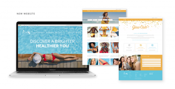
New brand elements were also deployed to create a completely new and refreshed website design. Featuring glowing and confident models surrounded by bright and bold colors, each page of the site highlights LightRx’s empowering spa experience and clinical excellence—leaving a lasting impression on potential clients.


Is your brand looking for a new look? Get in touch with Identity to begin your journey to a brand refresh today.
All Field Types
All field Types
"*" indicates required fields


