February 9, 2017
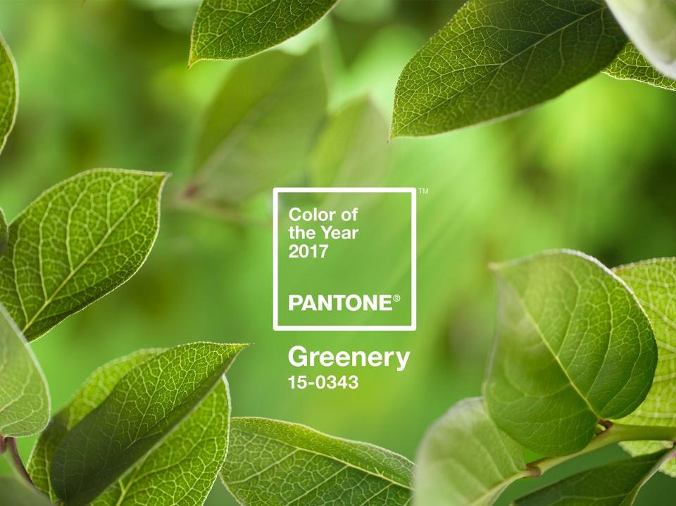
Just in case you’ve been living under a rock, it’s 2017. Donald Trump is the President of the United States of America. Driverless cars are moving past concept and into showrooms. And, Greenery is the color of the year.
Greenery?
The PANTONE Color Institute’s annual symbolic color reflects a snapshot of what is taking place in the global culture, and serves as an expression of a mood and an attitude. According to this 60-year-old color company, 2017’s Greenery is nature’s neutral. It’s a nod to mankind’s innate craving to connect with the natural world amidst the fast-paced realities of modern life.
So, what exactly qualifies Pantone to declare a worldwide hue to use, and why is the whole world actually listening? The answer to this question rests in the masterful evolution of the company—simple lessons in expanding authority and thought leadership that many brands could learn from.
Own the Space You're In
At its root in the world of graphic arts, Pantone revolved around the mission of identifying, matching and communicating colors. The PANTONE MATCHING SYSTEM® was the initial product of this mission. A numbered system of printing inks and formulas that enabled consistent color representation from vendor to vendor and run to run, PMS colors became (and remain) the industry’s most reliable standard operating procedure. The system is widely recognized by its signature fan color books.
WDPD? (What did Pantone do?) Starting with one industry with a dire need for improvement, Pantone became the solution. It offered the ability consistently and accurately execute plans for how intended colors reproduce on paper and other substrates. Not only did PMS meet a need, but it ingrained itself so much in industry process that the company name became synonymous with printing color.
The takeaway: The strongest way to establish your industry preeminence is to embed your product or niche service offering into the core operations of your industry. While that game-altering level of work may be tedious and slow-progressing, like a tree growing deep roots, it pays dividends in the fruit of brand recognition.
The "Where Applicable" Principle
With a firm grip on the print industry, Pantone took a strategic look at areas that naturally aligned with its demonstrated expertise. Other color-critical industries like digital technologies, textiles, plastics and paint were easy progressions from color fan books, as the same principles that apply to maintaining consistency on a printing press are applicable to interior/exterior paint and textile production for furniture and apparel lines.
WDPD? Pantone took the undeniable authority built in the graphic design world and transferred it any and everywhere applicable. Finding areas of logical alignment allows brands to expand their reach credibly, without diluting the hallmark of their offering.
The takeaway: Think about ways that the principles that make your offering unique could be aligned with related categories of service. While recognition of your brand comes with noted expertise, growth of the brand only happens if and/or when you’re willing to branch out (where applicable).
See the Bigger Picture
Fast forward that 50+ years since Pantone’s inception: Recognizing that color is everywhere, the company has not abandoned its influence and products for the print world, but instead has seized the opportunity to build and market an intangible commodity—‘Color Intelligence’. From this platform backed by the PANTONE Color Institute, the company offers a robust collection of color consulting services, trending research, color forecasts, fashion reports, and more. While its experience in a growing list of applications qualifies and informs the company’s valuable commentary, the willingness to share insight with the world established the company as an expert voice on all things color.
WDPD? It has been said that the height of authority is the ability and opportunity to teach another. Capitalizing on the expert status afforded by hallmark products, Pantone developed a consulting practice, including an offering helping brands to define their colors. It offers the world color trend reports in multiple industries. The company offers training in both applications and color theory.
The takeaway: While it’s easy to be protective of your brand’s experience and innovation as somewhat proprietary content, effectively and strategically sharing your insight is what makes you the authority.
The PANTONE® name is known worldwide as the standard language for color communication. That hard-earned clout has enabled the company to transcend ink on a printing press to now advise Sephora customers on which shade of eyeshadow to purchase. Brands should take note of this exceptional sphere of influence, and perhaps follow suit. (This year, that suit should—of course—be green.)
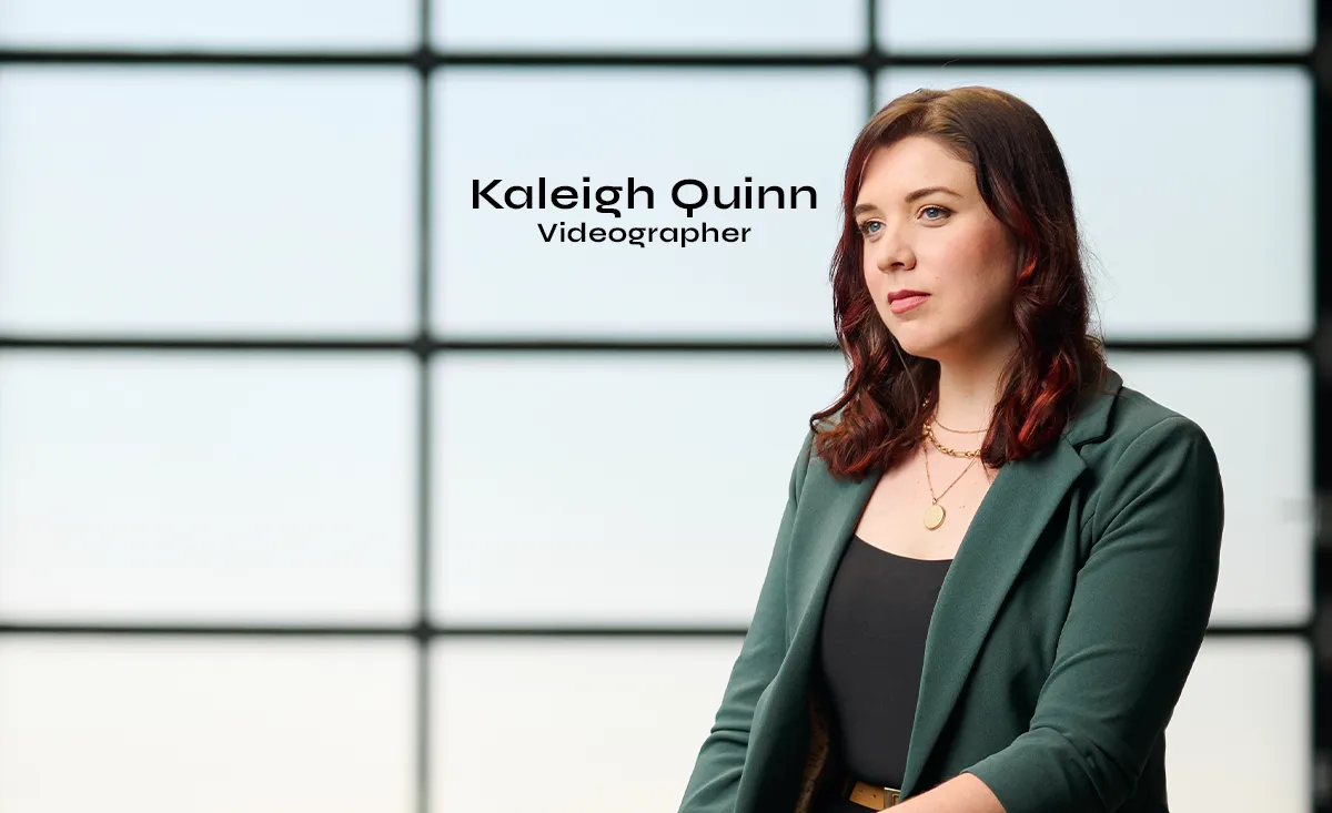
Kaleigh Quinn Joins Identity as Video Producer and Editor
Long-time collaborator Kaleigh Quinn has joined Identity in a full-time video production strategy and editing role.

Andrea Conrad and Kim Eberhardt Elevated to Vice President Roles
As we set our sights on an impactful year of great work, we’re recognizing Andrea Conrad and Kim Eberhardt as they step into their new vice president roles at Identity.