May 16, 2008
There has been a lot of talk about all of the Presidential Candidate's design choices. And much of the talk has been about Obama and the type his campaign has primarily used, Gotham.
An example...
John D. Berry, author of a series of books on typography, calls Gotham the font of 2008. "It's the hot one," he said. In a discussion of presidential branding on NPR's "On the Media," Gotham garnered praise for looking classy and clean, with one commentator likening it to an Armani suit. Online, typography blogs are full of love letters to the typeface, and one artist created a spitting image parody of an Obama sign declaring: "Gotham, a Font We Can Believe In."
Praise for his (although I really doubt he made the decision himself) choice of typeface aside, what has really set Obama's campaign design apart from the rest is consistency. Everything looks like part of whole and not just one off pieces, even if they are.
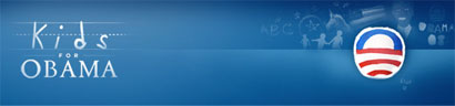
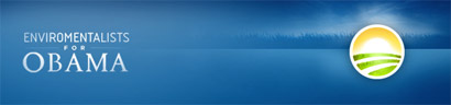
There are 14 different versions of this logo on his website (which is worlds better than any other political candidate's site), all of which focus on a different group of people. 14 different logos that all fit together and are all different.
The kids one kills me.
I think there has been so much talk about the candidate's design, specially Obama's for 2 two reasons. One, the primaries just keep going and have been for the last year. News organizations are running out things to talk about. Why else would The New York Times be talking about a typeface? The second reason speaks more to Obama, his look is different. It speaks to his message of change and being different. It stands out from Clinton and Mc Cain.

* This is not an endorsement of Obama…simply observations from a design nerd.

3 Trends We’re Watching in 2023
There’s no way to predict what will happen in 2023. But if you aren’t investing in PR, you’re missing an opportunity to put your best brand foot forward.

Measuring Your Employer Brand Successes
Measuring employer brand successes is critically important to understanding what works, what resonates with the team, and the appropriate adjustments for the future.