

Creating Signs That Get Seen
By: Michele Tate
For many brands, your company’s local signage is a first visual touchpoint for potential customers and clients within your community. Signs are passed by high volumes of drivers & pedestrians daily. As a single cost advertising expense, the semi-permanent landmark of a sign is often more cost effective per impression than any single ad. It may also garner more basic brand recognition than any campaign. In short, it’s worth the expense to have prime signage that really shows off your brand.
Understanding that the whole point of signage is to be seen, be sure to pay attention to three L’s—key factors that critically impact your sign’s visibility:
Legibility
The ability to read signage is made possible by the strategic design of that sign. Is the size of the logo and/or type large enough to be read from a distance? Do the colors used on your sign offer enough contrast so that the words can be clearly identified? Are the typefaces used simple enough to discern? Or do ornate details complicate reading efforts? Identity shared a detailed list of considerations on legibility—including recommendations from the United States Sign Council (USSC)—in an earlier post.
Location
‘Location, location, location’ is a fundamental principle of real estate, but is equally applicable to signage. Where your sign is placed—both in the overall environment, and in relation to your building and entrances—plays a major role in viewer recognition.
The intended viewer’s line of sight is an important consideration when deciding where your sign should go. Will passerby’s see you from a highway overpass? If so, your sign should be as high on the building as possible, facing oncoming traffic. Is your building tucked in amongst several other offices on the side of s suburban road? Then, you’ll want a sign that stands out as drivers pass, perhaps near the entrance to parking accommodations. When planning your signage, think about where the prime viewing opportunity exists; it’s not just at the entrance to your facility. Often dual signage is necessary to accommodate both brand recognition opportunities, and client direction once on the premises.
In addition, beware of obstructed viewing potential. Obstruction comes in many forms—often outside of your control. The beautiful climbing vines that might give your facility an added charm can be an obstruction. Your neighbor’s awning can become an obstacle to seeing your flush-mounted display. A sidewalk full of jutting shingle signs means that the one at the middle or end of the block cannot be clearly seen. Is that buried sign yours? There’s nothing more frustrating—or dangerous—to a driver than inching along in traffic, attempting to peer beyond an overgrown tree branch to see your obscure brand marker or building number. Be strategic; plan ahead for potential sign viewing hindrances and regularly evaluate environmental elements that might infringe on your visibility from critical viewing angles.
Lighting
Because signs live on the premises 24 hours a day, they have the potential to connect with your viewers even when the sun goes down. Capitalizing on that exposure means making sure your sign is appropriately lit. There are many functional options for lighting signage, including:
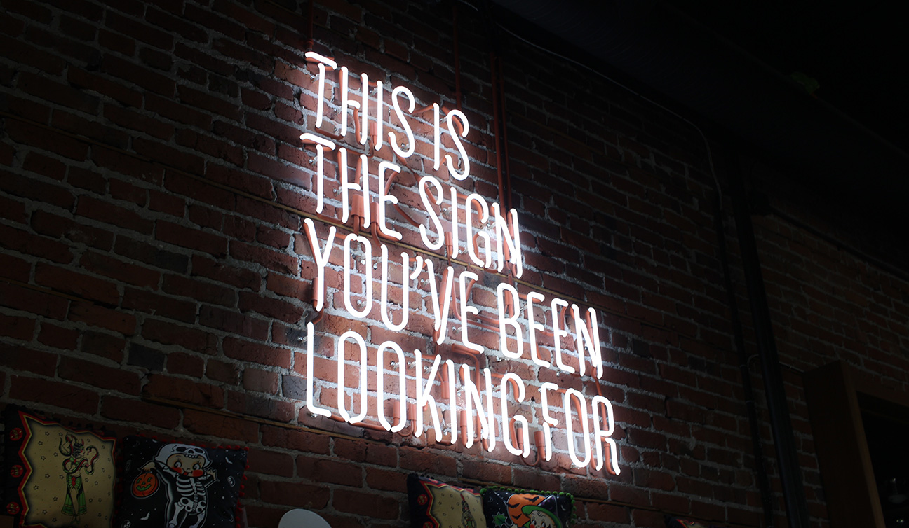
Neon—for a vintage feel. While less commonly used in our technological landscape, tubular neon lit signs are still very effective and popular for brands with strong historic ties and retro flavor.
Floodlights—for monument signs close to the ground. Floodlights not only shine a spotlight on your sign content, but add an illuminated glow to the physical structure that supports it.
Adjacent mount spotlights—for letters that don’t shine on their own. In the interest of simplicity and cost effective production, individual cut letter signs can easily be lit by a set of gooseneck spotlights. These lights are usually mounted to the building above or around signage.
Backlit LED Display—all-purpose solution for glowing internally or behind the scenes. LED lights have overtaken fluorescent lights as the most common lighting solution. LED usage to illuminate signs from behind is versatile, long lasting, and cost effective. Think of the way your TV displays images. That same panel of LED lights that makes you favorite show leap off the screen, will enliven your message and brand image when placed behind a broad area, branded sign panel.
Channel LED—for illuminated individual letters. Individual cut letter signs crafted with interior channels allow each letter to independently light up. This adds depth, dimension and finesse to your brand on display. Channel LED lighting dually offers the alternative of hiding lights behind the individual letters—a great Jedi mind trick that creates sharp black letterforms as negative space, surrounded by a sophisticated, glowing halo effect.
Lighting options and styles can also be used in conjunction to give your signs extra glow power. Use whatever solution(s) makes sense in your location to optimize visibility.
A point worth noting On Restrictions
Local regulations in some communities can mandate sign placement or style. Try not to default to simple type on a sign to appease the municipality. In the interest of recognition and continuity, maintaining even a piece of your brand image (whether in icon, color palette or type style) is worth fighting for.
Common milestones at which companies might consider updating signage are rebranding efforts, location moves or space remodeling. These opportunities also are usually planned well in advance. That means they offer ample time to prepare (and budget) for a sign upgrade. Should you need design or sourcing assistance when your signs are due for refreshing, Identity is happy to help!